Update (October 8, 2026): Google released Nano Banana 2.1 (
gemini-nano-banana-2.1) on October 6, 2026, and markedgemini-3.1-flash-image(Nano Banana 2) as deprecated in the Gemini API, recommending a move to 2.1. No shutdown date is announced (an October 29 date announced that day was withdrawn on October 7). Nano Banana 2 model IDs, prices and code below still work for now; new projects should start on 2.1. For what changes and how to migrate, see Nano Banana 2.1 Is Out: Access, API Pricing and Moving Off Nano Banana 2.
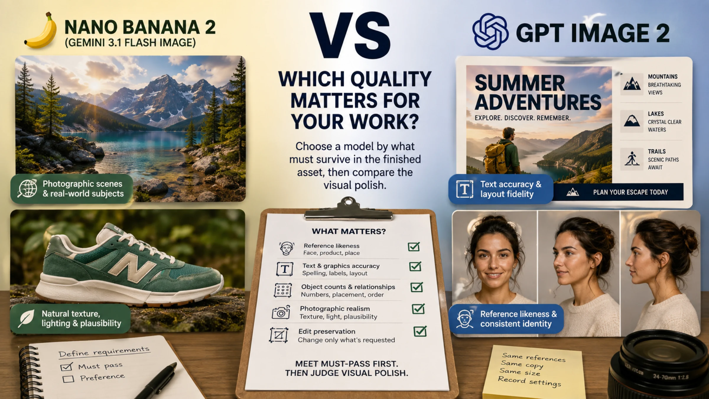
Start with GPT Image 2 for reference-based portraits and tightly specified layouts; give Nano Banana 2 an early try for photographic scenes and real-world subjects that benefit from search. Those are starting recommendations from Cupareanu’s reference-image comparison and fal’s four-prompt test, not a universal quality ranking. For an actual product or an edit that must preserve existing details, make preservation the deciding test before choosing either model.
The useful distinction is between an image you prefer looking at and an image you can deliver. Natural lighting cannot rescue a misspelled product name. An accurate headline does not compensate for changing a customer's face. When both outputs satisfy the requirements, aesthetic preference becomes a legitimate tiebreaker.
This comparison concerns Nano Banana 2, identified in Google's documentation as Gemini 3.1 Flash Image, and GPT Image 2. For API comparisons, record gemini-3.1-flash-image and gpt-image-2; OpenAI also lists the fixed snapshot gpt-image-2-2026-04-21. Nano Banana Pro, Lite and GPT Image 1.5 are different models. An app's general “image” mode may not establish which model produced a sample. Google model documentation, OpenAI model documentation.
Choose a starting model by the detail you cannot lose
The recommendations below are editorial judgments based on the cited examples. They help you decide where to begin; the acceptance conditions help you decide whether to keep the result.
| Your deliverable | Where to start | What decides whether it is usable |
|---|---|---|
| A recognizable person in new settings | GPT Image 2 | Compare facial structure and distinctive features with the actual reference, across every required image. |
| A poster, labeled diagram or multi-panel graphic | GPT Image 2 | Check exact copy, number of panels, label placement and the relationships the layout communicates. |
| An atmospheric photograph of an invented scene | Nano Banana 2, with GPT as an alternative | Inspect skin or material texture, light, physical plausibility and whether the requested action happened. |
| A recognizable real place | Nano Banana 2 with search available | Compare architecture and arrangement with reliable photographs; record whether search was enabled. |
| An existing product in a new setting | No default winner | Reject changed logos, proportions, colors, seams, controls or packaging, even if the photograph looks expensive. |
| A small change to an approved asset | Whichever preserves that asset | Compare the untouched areas as carefully as the requested edit. |
For a text-heavy campaign with an exact slogan, this means trying GPT first and checking the words before refining the lighting. For a fictional travel mood image without a real landmark to reproduce, try Nano first and judge the atmosphere after checking the scene. For a catalog shoe, start from the real shoe photographs and choose by product accuracy; a convincing invented sneaker is a different task.
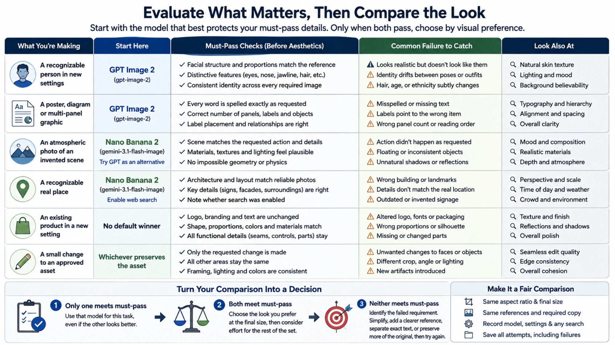
Explanatory illustration; not a sample from either model being compared.
Why credible comparisons reach different conclusions
The published results make more sense when you separate the task, the input and the author's judgment.
In her May 10, 2026 Amplifiers comparison, Daria Cupareanu tried ten prompts. She preferred GPT Image 2 for a collage based on her own selfie because it retained her recognizable identity; she also preferred its treatment of her cat's fur and plastic wrapping. Her carousel example, however, showed changing footer treatments and other inconsistencies in both models. That supports trying GPT for likeness, while still checking an entire series rather than approving it from one attractive frame. Cupareanu's original comparison.
In fal's May 6 four-prompt comparison, both models made errors in a train-station scene. An appealing GPT still life contained six oysters where seven were requested, while Nano produced four chilies instead of three. In a separate Habitat 67 example, the author enabled web search for Nano and preferred its building accuracy. That last result compares a search-assisted setup with one without the same assistance; it cannot isolate a raw model advantage. fal's original tests.
PixVerse's July 8 six-case comparison favored GPT on some panel and label instructions and Nano on some photographic examples. Its fisherman result also involved matching the requested action, not simply rendering detail. The shoe example generated a shoe without an established real product reference, so it does not settle which model preserves a specific item for a store listing. PixVerse's original comparison.
These are useful individual experiments, but they do not establish a population win rate. A review can prefer an invented portrait's texture while another prefers a different model's fidelity to a real person. Both judgments can be reasonable because the required outcomes differ.
Inspect the failure that would make you start over
For portraits, separate natural appearance from likeness. Skin can look believable while the jawline, eye spacing or defining features drift. If the person must be recognizable, compare against the source photograph before judging styling. Then look across the requested set: a strong headshot does not establish consistent identity in other poses.
For text and graphics, read every required word, then check its relationship to the illustration. A label can be spelled correctly but point to the wrong object. Panel count, reading order, number of objects and placement are separate requirements. If only the text needs correction, consider adding final copy in a design editor after selecting the image, especially when precise typography is part of the deliverable.
For photography, check material behavior and the action as well as detail. Look at contact shadows, transparent edges, reflections and how hands interact with objects. More texture is not automatically more realistic: excessive sharpening can turn skin, fabric or metal into something that feels processed. Judge the final image at its actual display size as well as in close-up.
For products, use the supplied item as the standard. Write down the features a customer would use to recognize that exact product. A model that creates a more polished advertisement but changes the fastener, label or silhouette has failed that job. If exact product geometry is essential, keeping the original product pixels and designing around them may be more dependable than regenerating the whole item.
For edits, name both the change and what must stay unchanged. “Replace the wall color; preserve the face, jacket, framing and lighting” is more useful than a general request to improve the image. Compare the original with the edited result. A successful wall edit can still introduce an unwanted facial change.
OpenAI documents automatic high-fidelity processing of GPT Image 2 references, along with remaining limitations in text placement, recurring characters, branding and structured composition. High fidelity describes how inputs are handled; it does not promise that these checks will pass. OpenAI's image generation guide.
Make a fair comparison at the size you will use
Resolution and correctness answer different questions. A larger file can reveal useful detail or simply make an incorrect label easier to read.
Google documents Nano Banana 2 output options through 4K, with thinking and optional web or image search. OpenAI supports flexible GPT Image 2 dimensions, including 3840 × 2160, but currently calls outputs above 3,686,400 total pixels experimental. GPT's low, medium and high settings are choices within its own system, not numerical equivalents of Google's settings. Google image generation documentation, OpenAI size and quality options.
For your comparison, choose the intended aspect ratio, crop and delivered dimensions first. Give both models the same source images and required copy. Record the model, app or API, quality settings and any search assistance so that an attractive result is something you can reproduce under the same conditions.
Compare both at the delivered size. A social graphic needs to communicate on a phone; an image intended for a large print needs closer inspection. If one preview is larger or compressed differently, normalize the exported copies before judging sharpness. Keep the original files so that resizing does not hide where a defect originated.
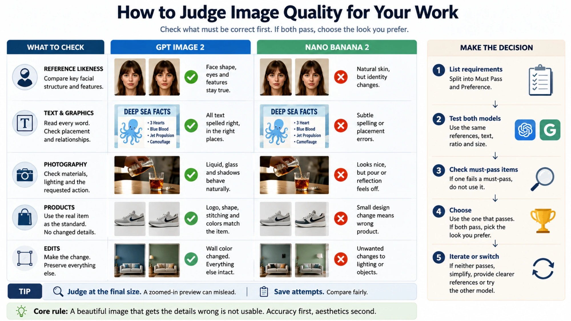
Explanatory illustration; not a sample from either model being compared.
Turn the comparison into a decision
Use one representative asset from the work you actually need to finish. Before generating, divide your requirements into must pass and preference. For a product announcement, exact packaging and headline might be mandatory; warmer light and a softer background might be preferences.
Keep the attempts you assess, including failures. Otherwise, comparing a favorite from many attempts with another model's first output mostly measures how much selection each received. If you allow edits, give each the same opportunity and note whether the correction damaged anything else.
Then make the choice in this order:
- Only one meets the mandatory requirements: use that model for this task, even if the other image is initially more striking.
- Both meet them: choose the visual treatment you prefer at the final display size, then consider the work needed to produce the rest of the set.
- Neither meets them: identify the failed requirement. Simplify the composition, supply a clearer reference, separate exact text from generated artwork, or preserve more of the original image before trying again.
Switch models when the same important failure persists, such as identity drift or broken label placement. Keep a model when it gives you a usable result with manageable corrections. The decision you need is which tool can deliver your particular image reliably enough—not which name deserves to win every comparison.