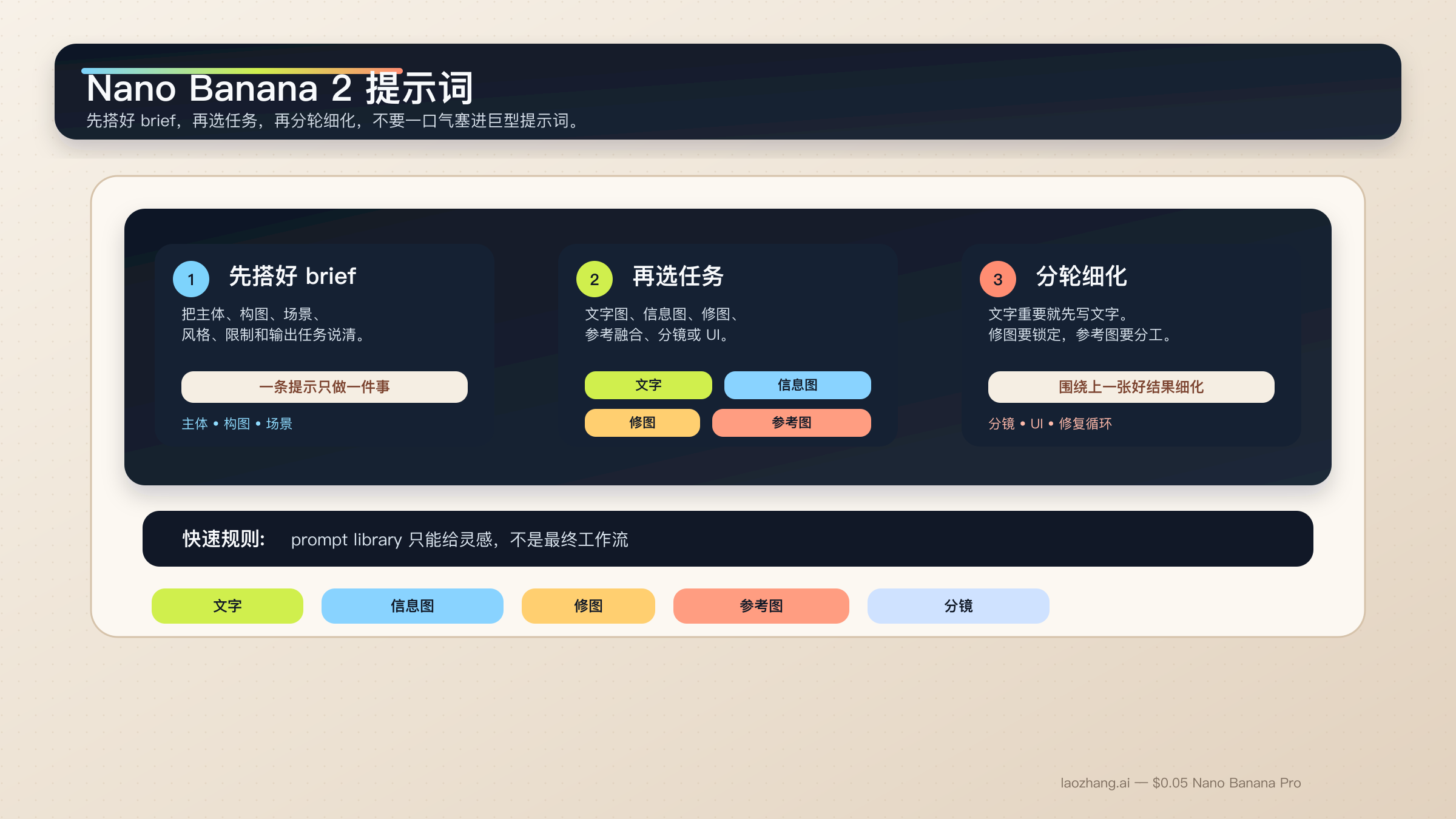
Nano Banana 2 提示词真正稳定的写法,不是把一堆风格词、质量词和平台热词塞进同一个输入框,而是把任务写成一份短而清楚的 brief:主体、构图、动作、场景、风格、限制条件,再补上这次输出真正要完成的工作。对文字图、信息图、修图和参考图任务来说,这种结构比收藏一百条“爆款提示词”更有用。
简短答案:先用一套六段式结构化提示,而不是照抄 prompt library。遇到重文字或本地化图形时,先定文字,再让模型渲染到图里。遇到编辑和参考图任务时,先锁定不能变的部分,再给每张参考图一个清楚角色。
这和 Google 当前的官方建议是对齐的。gemini-3.1-flash-image-preview 也就是 Nano Banana 2 背后的模型,在官方文档里一直强调同样几件事:提示要具体、要说明上下文和意图、复杂任务要分步、结果要在对话里迭代。Google 还特别提到,图片里有精确文字时,先生成或先确定文字,再让模型去出图,通常会更稳。
这篇本地化版本有一个刻意决定需要先说明。很多实际用户仍然会把工作提示词直接复制到 Gemini 里,所以文中的代码块保留了接近英文工作流的写法。你真正要本地化的是引号里的标题、按钮文案、标签内容,以及围绕任务的结构说明,而不是把 prompt 变成更长的翻译稿。
还要尽早讲清一个前提。Nano Banana 2 是大多数快节奏图片工作的默认路线,但它不是所有场景的答案。如果你的任务已经变成高价值品牌图、严格参考图约束,或者图片里的文字精度对业务很关键,那就应该顺手再读 Nano Banana 2 vs Nano Banana Pro。对多数读者来说,下一步不是立刻换模型,而是先学会把 Nano Banana 2 当成一个可控的制作系统,而不是一个随机抽卡玩具。
| 你的任务类型 | 建议先用的提示模式 | 最不能省略的部分 |
|---|---|---|
| 文字海报或宣传图 | 两步式 exact-text workflow | 先定文案,再把精确文字写进出图提示 |
| 信息图或标注图 | 事实型 layout prompt | 把组件和层级写清,再人工核对标签 |
| 局部修图 | change-only prompt | 明确改什么,也明确什么必须保持不变 |
| 多图参考融合 | 角色分配型多图提示 | 每张图只负责主体、风格、产品或环境中的一种 |
| 角色一致性 | canonical-reference prompt | 先锁脸部、比例和服装锚点,再换场景 |
| 分镜或 UI 草图 | composition-first prompt | 先讲布局结构,再讲风格语言 |
先用这套 Nano Banana 2 提示词公式起步
想让 Nano Banana 2 提示词变稳,最有效的方法不是再去抄更多零碎片段,而是先停掉“关键词拼盘”这种写法。这个模型更擅长处理描述式场景、受控编辑和多轮 refinement,而不是一长串互不相连的风格形容词。一个好提示词,通常更像一份短 brief。
不知道怎么开始时,可以先用这套基础公式:
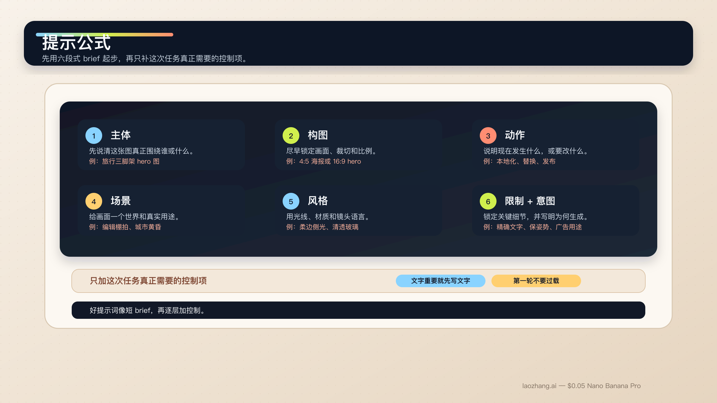
text[Subject]. Framed as [composition / lens / aspect ratio].
[Action or change].
Set in [scene / environment / context].
Visual style: [lighting / materials / color / mood].
Constraints: [what must remain, exact text, references, things to avoid].
Output intent: [poster / product shot / infographic / storyboard / UI / edit].
每一段各自负责一件事:
Subject:画面真正围绕谁或什么展开。Composition:镜头远近、角度、裁切和比例。Action or change:正在发生什么,或者你希望改什么。Context:事情发生在什么环境里,要遵循什么现实逻辑。Style:光线、材质、色调和最终气质。Constraints and output intent:精确文字、必须锁死的细节、版式要求,以及图片为什么存在。
最常崩的其实就是最后一行。很多人以为出图不稳,是因为风格词不够多,实际上更常见的问题是任务意图太模糊。比如“做一个 logo”过于宽;“给高端酒店 SPA 线护肤品牌做一个极简 logo”就已经是模型能理解的工作指令。Nano Banana 2 能帮你推理意图,但前提还是你要告诉它,这张图到底是为了什么而生成。
官方 Gemini 图片生成文档 说得很直接:越具体、越有上下文、越能分步骤迭代,结果就越稳。与此同时,Gemini 3.1 Flash Image 模型卡 也明确展示了 Google 在文本渲染、信息图、角色一致性、多轮编辑和多图任务上对模型的评估方向。这也是为什么真正有价值的提示词文章,应该按任务拆,而不是只堆一墙灵感图。
这个模型家族还有一条特别重要的经验:一个 prompt 最好只负责一个主任务。如果你同时要精确文字、语言替换和基于旧图的编辑,就应该拆成多步。如果你要同时控制多个角色或很多物体,也要先写清层级,接受多轮 workflow 比“第一条就神级出图”更稳。Google 当前文档里写到,Nano Banana 2 支持最多四个角色、最多十个物体,以及最多十四张参考图。这是能力上限,不是每次都该塞满的建议。
在实践里,更稳的顺序通常是:先拿到基础构图,再锁定必须保留的细节,再做精确文字或本地化修改,最后只对漂移的症状做窄修。若你想先把模型能力面看清楚,再回来写提示词,可以先读 Nano Banana 2(Gemini 3.1 Flash Image Preview)。
适合文字、信息图和本地化图形的提示模板
Nano Banana 2 在文字图和信息图上的表现,比旧版 Gemini 图片流已经强不少,但它依然不是“一句咒语直接搞定全部文字”的模型。只要图片里的文字是交付的一部分,你就应该先定 copy,再告诉模型这些词应该怎么出现、出现在哪里、层级怎么分。
1. 带精确文案的海报或发布图
适合文字本身就是交付物,而不是后期再贴上去的场景。
textTurn 1:
Write one 6-word headline and one 14-word subhead for a launch poster about a lightweight travel tripod for creators.

Turn 2:
Create a 4:5 product launch poster for a compact carbon-fiber travel tripod standing on a stone pedestal. Clean premium studio look, muted graphite background, soft edge lighting, wide top margin.
Render the exact headline "READY TO MOVE LIGHT" in bold uppercase sans-serif near the top.
Render the exact subhead "Stable enough for long exposure, small enough for a carry-on." below it in smaller white text.
Keep the typography crisp, aligned, and readable at thumbnail size.
Output intent: premium ad creative.
为什么有效:因为文案已经先定了,Nano Banana 2 就能把更多推理预算放在构图和渲染,而不是在压力下胡乱编字。
2. 信息图或标注型结构图
适合图片必须负责“解释”,而不只是“好看”的场景。
textCreate a 16:9 infographic explaining a mirrorless camera sensor stack. Show these labeled components from front to back: cover glass, microlens array, color filter array, photodiodes, wiring layer, sensor substrate.
Use a clean flat editorial style with wide margins, short labels, thin leader lines, and one callout area for "light path".
Keep the diagram factual, readable, and easy to scan in 3 seconds.
Output intent: educational article graphic.
为什么有效:这里最重要的不是视觉 mood,而是信息架构本身。
3. 只换语言、不破坏现有版式
适合你已经有一张可用英文图,只需要把它改成另一种语言的时候。
textUpdate this existing infographic to Spanish.
Do not change the layout, icon positions, color system, chart proportions, or visual hierarchy.
Replace all English text with natural Spanish text that fits the same design style.
Keep the headings short and the body labels easy to read.
Output intent: localized marketing graphic.
为什么有效:这是 change-only 的本地化提示。它先告诉模型哪些东西必须锁住,而这恰恰是大多数 prompt library 根本没讲清的部分。
适合写实场景、产品图和品牌视觉的提示模板
想让 Nano Banana 2 出更像摄影而不是更像“AI 平均图”,关键不是再加一个 realistic,而是开始像摄影师或 art director 一样描述画面。构图、镜头感、光线和这张图真正的用途,通常比泛泛的“高质量”标签更重要。
4. Editorial 人像
适合主体应该看起来像真实拍摄,而不是泛 AI 补光的时候。
textA waist-up editorial portrait of a ceramic artist in a bright studio. 3:4 composition, subject slightly off-center, captured with an 85mm portrait lens look.
The artist is shaping a clay bowl while looking just past the camera.
Set in a sunlit workshop with pale walls, wooden shelves, and small traces of clay dust in the air.
Visual style: soft natural window light from camera-left, warm skin tones, realistic fabric texture, calm magazine mood.
Constraints: keep the hands natural and the studio believable.
Output intent: editorial feature image.
为什么有效:提示把镜头、动作和真实感重点都讲清楚了。
5. 产品 hero 图或发布横幅
适合产品本身是主角,构图要能直接用于商业页面的时候。
textCreate a 16:9 premium product hero image of a matte black wireless speaker on a dark stone plinth.
Three-quarter view, low camera angle, the speaker centered with controlled negative space on the left for future headline placement.
Set in a minimal studio environment with subtle haze and soft reflected highlights.
Visual style: luxury commercial photography, clean shadows, brushed texture detail, restrained graphite and silver palette.
Constraints: no extra props, no floating UI, no fake sales text.
Output intent: homepage hero banner.
为什么有效:它不只说明产品长什么样,还说明了留白为什么存在、未来标题要放在哪里。
6. 带真实地理锚点的城市或旅行场景
适合现实世界细节很重要、并且你的产品链路支持 Grounding with Google Search 的场景。
textCreate a twilight editorial travel image of a rain-slicked street scene near Pike Place Market in Seattle.
Wide environmental composition with the market sign visible in the scene and the Space Needle grounded in the distance.
The foreground should include a couple under one umbrella walking past a cafe chalkboard.
Visual style: cinematic wet reflections, realistic signage, cool blue ambient light with warm cafe spill.
Constraints: keep the city details plausible and the typography readable.
Output intent: travel feature illustration.
为什么有效:它把真实世界锚点和场景目标一起写清楚了,而不是空泛地堆景点名词。
适合修图、参考图和多图融合的提示模板
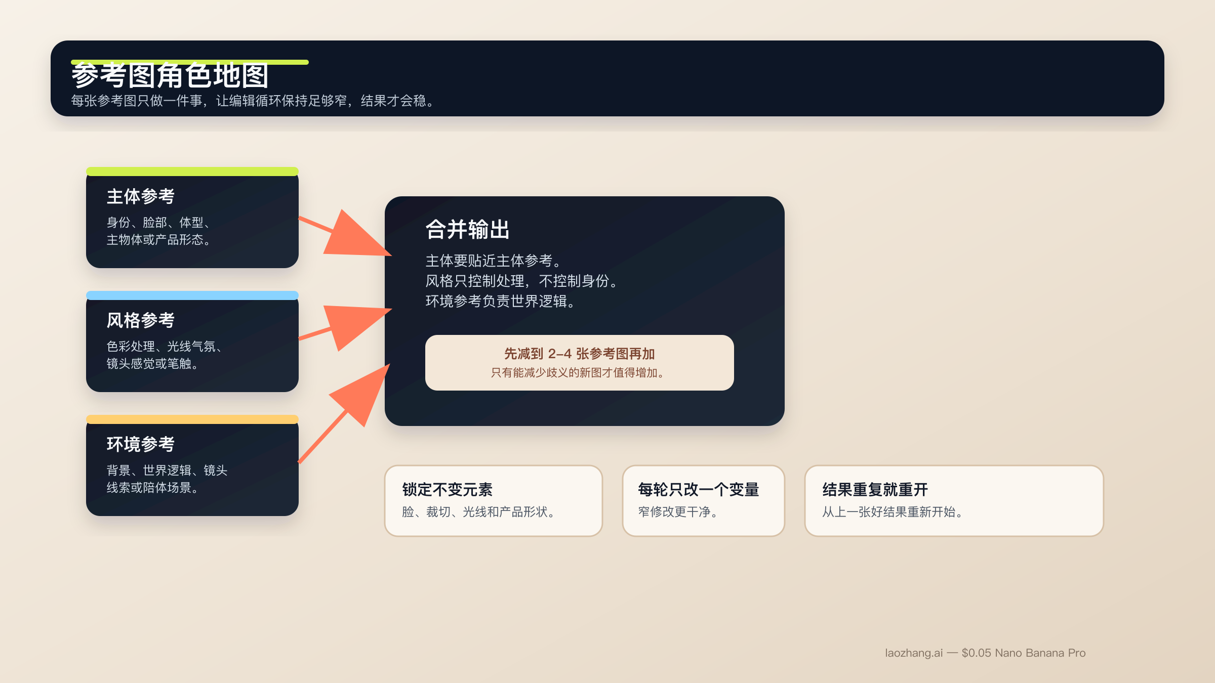
这一类任务是 Nano Banana 2 最有价值、也最容易漂移的地方。模型在语义编辑上确实很强,但前提是你要明确告诉它什么必须保持冻结。参考图也是同样的道理。虽然文档允许更多参考输入,但真正稳定的设置依然是小而明确:先用两到四张最重要的图,并且给每张图一份单独工作。
如果你想把 edit workflow 再看得更完整一点,可以接着读 Gemini image-to-image editing 指南。
7. 只改一处的修图提示
适合只想改一个细节、其他部分都必须保住的时候。
textUsing the provided image, change only the jacket color to deep forest green.
Keep the same face, pose, body position, camera crop, lighting direction, background blur, and fabric texture.
Do not change any other clothing items or the expression.
Output intent: controlled wardrobe edit.
为什么有效:修改范围非常窄,而且锁定项列得很明确。
8. 按角色分工的参考图融合
适合多张图分别承担不同职责的时候。
textUse Image A for the subject's face and body proportions.
Use Image B for the illustration style and color treatment.
Use Image C for the forest environment and fog mood.
Create a 3:4 fantasy book-cover portrait of the subject walking through that forest at dawn.
Keep the face closest to Image A, the brushwork closest to Image B, and the atmosphere closest to Image C.
Constraints: preserve one clear focal subject and avoid mixing the references into a crowded collage.
Output intent: character-led cover art.
为什么有效:每张图各管一件事,不会变成“大家一起抢控制权”。
9. 参考图驱动的产品场景图
适合产品设计必须忠实保留,但周围环境可以变化的时候。
textUse Image A as the handbag reference and Image B as the photography-style reference.
Create a 4:5 fashion campaign image of a woman walking in Paris at golden hour while carrying the handbag from Image A.
Keep the bag shape, hardware, stitching, and materials faithful to Image A.
Use the editorial color treatment, soft lens bloom, and shallow depth of field style from Image B.
Constraints: the bag must remain the hero object even though the scene is lifestyle-driven.
Output intent: product campaign creative.
为什么有效:产品和风格被拆开处理,比一句“把这个产品做成那张图的样子”要清楚得多。
适合角色一致性、分镜和 UI 布局工作的提示模板
官方文档和模型卡都很明确:Nano Banana 2 不只是单张生图模型。Google 也在角色一致性、多轮流程和结构化视觉设计任务上评估它。但这不意味着模型会自动理解你的角色设定文档或设计系统。真正有用的是,你先把 canonical 细节锁住,再给场景一个清楚的结构。
10. 保持角色一致性的场景图
适合同一角色、同一吉祥物需要跨场景复用的时候。
textUse the provided character image as the canonical reference.
Create a 16:9 scene of the same character standing in a bright startup office, holding a tablet and talking with a small team.
Keep the same face, hair shape, body proportions, jacket color, and overall age.
Only change the pose, camera angle, and environment.
Visual style: polished editorial realism with clean daylight and subtle depth of field.
Output intent: brand storytelling image.
为什么有效:它先定义身份锚点,再允许你改变动作和环境。
11. 三格分镜
适合重点在连续叙事和镜头推进,而不是单张 hero 图的时候。
textCreate a 3-panel storyboard in a clean cinematic concept-art style.
Panel 1: wide establishing shot of a courier arriving at a neon-lit train platform at night.
Panel 2: medium shot as the courier opens a metal case and checks a glowing device.
Panel 3: close-up of the courier looking up as the train lights appear in the fog.
Keep the same character design, coat color, bag shape, and lighting logic across all panels.
Output intent: visual storytelling board.
为什么有效:每一格都有明确工作,但角色与光线逻辑仍然保持全局一致。
12. UI 或 landing page 草图
适合你要的是页面布局概念,而不是纯插画的时候。
textCreate a clean 16:9 SaaS landing-page mockup for a project-planning product.
The hero area should show a strong headline region on the left, one primary call-to-action button, one secondary text link, and a product dashboard preview on the right.
Use a 12-column grid feel, clear spacing, restrained color palette, and realistic interface hierarchy.
Visual style: premium modern product design, soft shadows, crisp typography, subtle gradients.
Constraints: avoid fake lorem ipsum walls and avoid cluttering the dashboard with meaningless widgets.
Output intent: polished website concept.
为什么有效:UI 提示最常见的问题,是只有风格没有结构。这个模板把页面必须包含什么、层级应该怎样一并交代清楚了。
如果你的 UI 工作已经进入高要求参考图、多品牌约束或精细排版阶段,Nano Banana Pro 依然是更合理的 premium 路线。这也是为什么你最好顺手再读 Nano Banana Pro 提示词指南 和 Nano Banana Pro 参考图指南。
如何修复漂移、坏文字、被拦截编辑和发虚结果
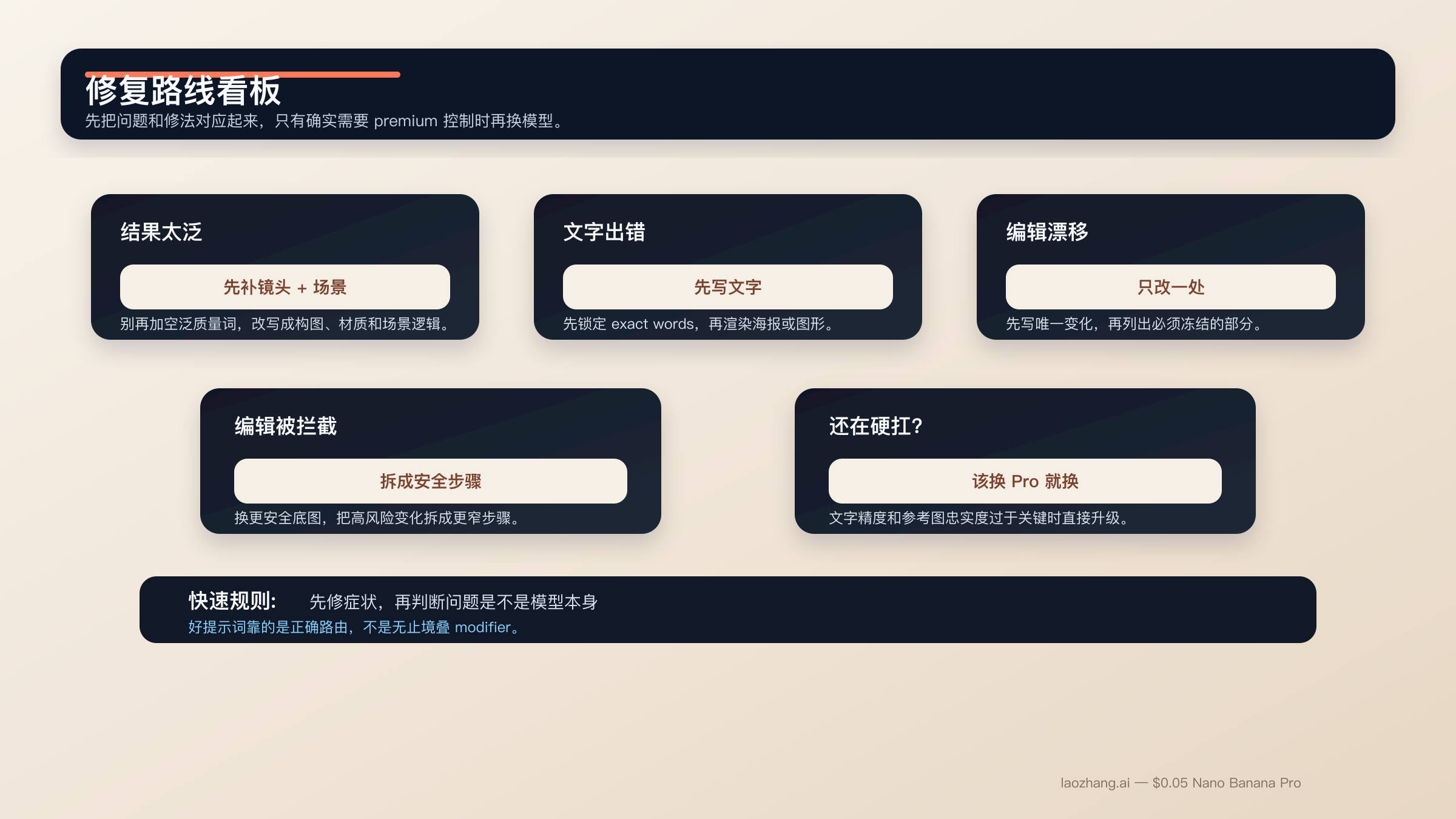
大部分 Nano Banana 2 提示失败,并不神秘。通常只是因为你一次想让模型同时解决太多任务、没有锁定必须保留的部分,或者把复杂修图当成简单 text-to-image 在做。最快的改善往往不是再加一堆修饰词,而是把 prompt 收窄,并把执行顺序重新排清楚。
如果结果太泛,或者一眼就很“AI”。 别再加 random quality tags。改成补镜头语言、场景逻辑和材质细节。像 “photorealistic, detailed, 4K” 这种词堆,通常都比不上 “three-quarter product shot, brushed metal texture, morning side light” 这种真正可执行的描述。
如果文字一直出错。 回到 text-first。先把标题、副标题、按钮文案、图例、标签列表定下来,再让 Nano Banana 2 渲染这些 exact strings。重要文字加引号,层级尽量简单。
如果编辑一改就连带改太多。 把需求改写成 change-only prompt。先说唯一的变化,再列出锁定项:脸、姿势、裁切、光线、背景、材质、logo 位置。
如果参考图融合越来越糊。 减少活跃参考图。每张图只负责一件事。主体一张、风格一张、环境一张,通常比六张半相关图片一起抢控制权干净得多。
如果场景过于复杂。 用 step-by-step prompting。先拿背景,再补主体,再加文字或本地化层。Nano Banana 2 之所以适合多轮 workflow,不是因为它能一条做完全部,而是因为它能在你不重置任务的前提下逐步收紧结果。
如果提示开始触发拦截。 社区对 Nano Banana 2 和更广泛 Gemini 图片面的反馈都说明,人物相似度保留、敏感变形和模糊语义编辑,比很多人预想的更容易碰到 policy 边界。最实用的做法不是和过滤器斗智斗勇,而是换更安全的底图、保持编辑用途正常、把高风险变化拆成允许的几步。
如果你已经在强行把 Nano Banana 2 用成 Pro。 那就该换模型,而不是无限升级提示复杂度。Nano Banana Pro 仍然更适合高价值品牌图、必须准的文字排版、更高参考图忠实度,以及出错代价很高的最终 4K 成品。
FAQ
Nano Banana 2 提示词是不是一定要写很长?
不一定。它应该完整,但不应该臃肿。一个短而结构清楚、意图明确的 brief,通常比一条又长又乱的提示词更稳。如果任务真的复杂,把缺失信息放到第二轮、第三轮补,比第一轮硬塞进去更有效。
为了得到更好的结果,必须用英文写 prompt 吗?
不一定。Nano Banana 2 支持多语言,本地化图形也是 Google 当前文档里的真实用例。真正更重要的是清晰度、需要时使用精确引号文本,以及让视觉任务保持单一。只是到了高控制品牌工作里,很多团队仍然会先用英文拿基线,再在后续轮次做本地化。
参考图应该放几张?
先从两到四张最重要的开始,即使模型支持更多也一样。主体一张、风格一张、环境一张,最多再加一张关键产品或物件,通常就够了。只有当你非常清楚每张附加图片具体控制什么时,再继续加。
Grounding with Google Search 会让所有 prompt 都更好吗?
不会。它在依赖现实世界视觉事实的场景里最有价值,比如地点、标识、产品外观。对于抽象插画、风格肖像或本来就很清楚的产品图,它的重要性就没那么高。
什么时候应该停止优化 Nano Banana 2 提示词,直接换到 Nano Banana Pro?
当文字精度已经是业务关键、参考图忠实度必须更高,或者最终图片是高风险、高价值的 4K 品牌资产时。如果你已经花了太多轮次,只为了把 Nano Banana 2 强行逼成 premium-control 工具,那通常说明问题出在路由,而不在词还不够多。
结论很简单。真正有效的 Nano Banana 2 提示词,更像一份只做一件事的短制作说明。先用结构化公式起步,再挑对应任务的模板,最后把高难文字和复杂编辑拆成多步。这种方法没有“大词库”那么花哨,但更能长期复用。