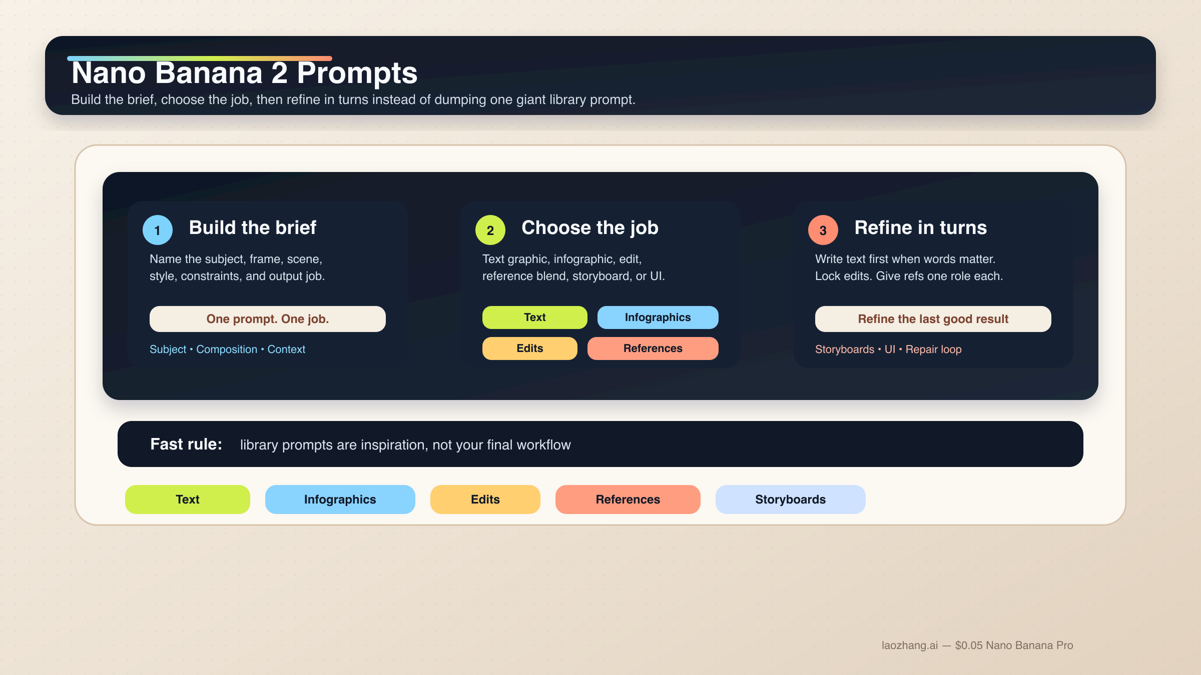
Nano Banana 2에서 결과가 안정적으로 나오는 프롬프트는 거대한 keyword pile이 아닙니다. subject, composition, action, context, style, constraints를 순서대로 적은 짧은 제작 brief에 가깝습니다. 그리고 그 위에 이번 작업에 꼭 필요한 제어만 더하면 됩니다. 텍스트 그래픽, 인포그래픽, 편집, 레퍼런스 이미지 작업에서는 이런 구조가 prompt library를 더 모으는 것보다 훨씬 재현성이 높습니다.
짧은 답: Nano Banana 2는 6단계 구조화 프롬프트로 시작하는 것이 가장 안전합니다. 텍스트가 중요한 작업은 text-first 2단계 흐름으로 처리하고, 편집이나 reference 작업은 무엇을 고정할지 먼저 적고 각 이미지에 한 가지 역할만 주는 편이 낫습니다.
이 방향은 Google의 현재 공식 가이드와도 맞습니다. gemini-3.1-flash-image-preview, 즉 Nano Banana 2의 기반 모델에 대해 Google 문서는 계속해서 구체성, 문맥, 의도, 대화형 반복, 복잡한 장면의 단계적 분해를 강조합니다. 이미지 안의 텍스트 역시 먼저 텍스트를 정한 뒤 그 문자열을 렌더링하게 할 때 더 잘 나온다고 설명합니다.
이 로컬라이즈 버전에는 하나의 실무 전제가 더 있습니다. 많은 사용자가 여전히 Gemini에 작업용 프롬프트를 영어로 그대로 넣습니다. 그래서 아래 코드 블록은 source 기사와 가까운 operational English를 유지했습니다. 실제로 현지화해야 하는 것은 따옴표 안의 문구, 라벨, 버튼 copy, 그리고 작업 구조입니다.
다만 초반에 분명히 해야 할 caveat도 있습니다. Nano Banana 2는 대부분의 빠른 이미지 작업에서 기본값이지만, 모든 일의 정답은 아닙니다. premium typography, 더 엄격한 reference fidelity, 비싼 브랜드 결과물이 필요하다면 다음으로 읽어야 할 것은 Nano Banana 2 vs Nano Banana Pro 입니다. 많은 경우 핵심은 모델을 곧바로 바꾸는 것이 아니라, Nano Banana 2를 random prompt toy가 아니라 working creative system으로 다루는 것입니다.
| 작업이 이런 경우 | 먼저 써볼 패턴 | 절대 빼면 안 되는 부분 |
|---|---|---|
| 텍스트 그래픽이나 포스터 | exact-text 2단계 흐름 | 먼저 문구를 정하고 그 문자열을 이미지 프롬프트에 넣기 |
| 인포그래픽이나 라벨 다이어그램 | factual layout prompt | 구성요소와 위계를 지정하고 마지막엔 사람이 검수하기 |
| 사진 편집 | change-only prompt | 무엇을 바꾸고 무엇을 유지할지 둘 다 적기 |
| 레퍼런스 블렌딩 | role-based multi-image prompt | 각 이미지에 subject, style, product, environment 중 하나의 역할만 주기 |
| 캐릭터 일관성 | canonical-reference prompt | 얼굴, 체형 비율, 의상 앵커를 먼저 잠그기 |
| 스토리보드나 UI 목업 | composition-first prompt | 먼저 구조와 배치를 설명하고 그다음 스타일을 적기 |
먼저 이 Nano Banana 2 프롬프트 공식을 기준으로 시작하세요
Nano Banana 2 프롬프트를 강하게 만드는 가장 빠른 방법은 prompt library 조각을 이어 붙이는 습관을 버리는 것입니다. 이 모델은 설명형 scene prompt, 제어된 edit, multi-turn refinement에는 강하지만 disconnected adjective stack에는 덜 강합니다. 좋은 프롬프트는 대체로 짧은 creative brief처럼 읽힙니다.
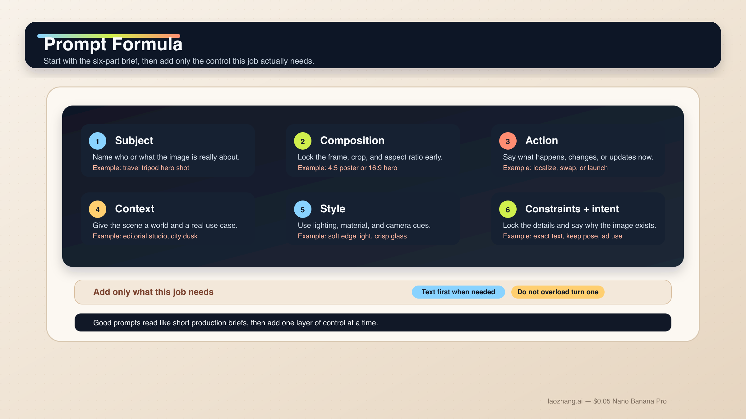
막막할 때는 아래 기본 공식을 쓰면 됩니다.
text[Subject]. Framed as [composition / lens / aspect ratio].
[Action or change].
Set in [scene / environment / context].
Visual style: [lighting / materials / color / mood].
Constraints: [what must remain, exact text, references, things to avoid].
Output intent: [poster / product shot / infographic / storyboard / UI / edit].
각 부분의 역할은 다음과 같습니다.
Subject: 이미지의 중심이 되는 대상.Composition: 거리, 앵글, 비율, 크롭.Action or change: 무엇이 일어나거나 무엇을 바꿀지.Context: 어떤 세계와 상황에서 일어나는지.Style: 빛, 소재, 색감, 분위기.Constraints and output intent: exact text, 고정 요소, layout 요구, 이 이미지가 존재하는 이유.
가장 자주 무너지는 부분이 마지막 줄입니다. 많은 사용자가 style word가 부족하다고 생각하지만 실제로는 intent가 약한 경우가 더 많습니다. "Create a logo"는 너무 넓고, "Create a logo for a minimalist skincare brand sold in premium hotel spas"는 모델이 이해할 수 있는 usable job입니다. Nano Banana 2는 intent를 추론할 수 있지만, 이 이미지가 무슨 일을 해야 하는지는 여전히 사람이 말해 줘야 합니다.
공식 Gemini image-generation docs 역시 specific prompts, context, iteration, step-by-step construction이 giant adjective stack보다 중요하다고 말합니다. 그리고 Gemini 3.1 Flash Image model card는 text rendering, infographics, character work, multi-turn editing, multi-image tasks를 평가 축으로 보여 줍니다. 그래서 task-first 가이드는 generic inspiration gallery보다 훨씬 쓸모가 있습니다.
이 모델 계열에서 더 중요한 규칙은 1 prompt = 1 main job 입니다. exact text, localization, 기존 이미지 edit를 동시에 원한다면 단계를 나누는 편이 훨씬 안전합니다. 여러 캐릭터와 많은 오브젝트도 마찬가지로, 계층을 먼저 쓰고 필요하면 여러 turn으로 나누세요. Google 문서는 Nano Banana 2가 최대 4명의 캐릭터, 최대 10개의 오브젝트, 최대 14장의 reference image를 다룰 수 있다고 설명하지만, 그건 capability ceiling이지 매번 그렇게 밀어 넣으라는 뜻이 아닙니다.
실무에서는 먼저 베이스 구도를 잡고, 다음에 살아남아야 할 디테일을 고정하고, 그다음 exact text나 localized layer를 넣고, 마지막에 drift만 좁게 수정하는 흐름이 가장 안정적입니다. 전체 모델 표면을 먼저 이해하고 싶다면 Nano Banana 2와 Gemini 3.1 Flash Image Preview 를 먼저 읽어도 좋습니다.
텍스트, 인포그래픽, 로컬라이즈드 그래픽용 프롬프트 템플릿
Nano Banana 2는 이전 Gemini 이미지 흐름보다 text rendering과 infographics에 강해졌지만, 여전히 "text in image"를 한 방의 마술로 다루지 않는 편이 낫습니다. 텍스트가 deliverable의 일부라면 먼저 copy를 결정하고, 그다음 어떻게 보여야 하는지 모델에 지시하세요.
1. exact text가 들어가는 포스터나 launch graphic
텍스트가 그림의 일부이지 나중에 덧붙이는 것이 아닐 때 씁니다.
textTurn 1:
Write one 6-word headline and one 14-word subhead for a launch poster about a lightweight travel tripod for creators.

Turn 2:
Create a 4:5 product launch poster for a compact carbon-fiber travel tripod standing on a stone pedestal. Clean premium studio look, muted graphite background, soft edge lighting, wide top margin.
Render the exact headline "READY TO MOVE LIGHT" in bold uppercase sans-serif near the top.
Render the exact subhead "Stable enough for long exposure, small enough for a carry-on." below it in smaller white text.
Keep the typography crisp, aligned, and readable at thumbnail size.
Output intent: premium ad creative.
왜 잘 되나 하면, 먼저 copy가 고정되기 때문에 Nano Banana 2가 텍스트를 즉석에서 꾸며내는 대신 구도와 렌더링에 더 집중할 수 있기 때문입니다.
2. 인포그래픽이나 라벨 다이어그램
이미지가 설명 역할을 해야 할 때 씁니다.
textCreate a 16:9 infographic explaining a mirrorless camera sensor stack. Show these labeled components from front to back: cover glass, microlens array, color filter array, photodiodes, wiring layer, sensor substrate.
Use a clean flat editorial style with wide margins, short labels, thin leader lines, and one callout area for "light path".
Keep the diagram factual, readable, and easy to scan in 3 seconds.
Output intent: educational article graphic.
여기서 중요한 것은 visual mood보다 information architecture입니다.
3. 기존 그래픽의 언어만 바꾸기
영문 그래픽이 이미 잘 작동하고 있고 언어만 바꾸면 될 때 적합합니다.
textUpdate this existing infographic to Spanish.
Do not change the layout, icon positions, color system, chart proportions, or visual hierarchy.
Replace all English text with natural Spanish text that fits the same design style.
Keep the headings short and the body labels easy to read.
Output intent: localized marketing graphic.
이건 change-only localization prompt입니다. 고정해야 할 것을 먼저 말해 주기 때문에 불필요한 layout drift가 줄어듭니다.
리얼한 장면, 제품 샷, 브랜드 비주얼용 템플릿
Nano Banana 2는 단순히 "realistic"이라고 적는 것보다 사진가나 art director처럼 장면을 설명했을 때 크게 좋아집니다. composition, lens feel, lighting, 이미지의 역할이 generic quality modifier보다 훨씬 중요합니다.
4. Editorial portrait
피사체가 실제 촬영된 것처럼 보여야 할 때 씁니다.
textA waist-up editorial portrait of a ceramic artist in a bright studio. 3:4 composition, subject slightly off-center, captured with an 85mm portrait lens look.
The artist is shaping a clay bowl while looking just past the camera.
Set in a sunlit workshop with pale walls, wooden shelves, and small traces of clay dust in the air.
Visual style: soft natural window light from camera-left, warm skin tones, realistic fabric texture, calm magazine mood.
Constraints: keep the hands natural and the studio believable.
Output intent: editorial feature image.
이 프롬프트는 프레이밍, 동작, 어떤 종류의 리얼리즘이 중요한지까지 함께 전달합니다.
5. Product hero 또는 launch banner
제품이 주인공이고 layout도 실제 상업 사용이 가능해야 할 때 씁니다.
textCreate a 16:9 premium product hero image of a matte black wireless speaker on a dark stone plinth.
Three-quarter view, low camera angle, the speaker centered with controlled negative space on the left for future headline placement.
Set in a minimal studio environment with subtle haze and soft reflected highlights.
Visual style: luxury commercial photography, clean shadows, brushed texture detail, restrained graphite and silver palette.
Constraints: no extra props, no floating UI, no fake sales text.
Output intent: homepage hero banner.
제품 모습뿐 아니라 빈 공간이 왜 필요한지까지 설명하기 때문에 실제 사용에 맞는 구도가 나옵니다.
6. 현실 앵커가 있는 travel / city scene
실제 세계 맥락이 중요하고 Grounding with Google Search를 쓸 수 있는 흐름에 적합합니다.
textCreate a twilight editorial travel image of a rain-slicked street scene near Pike Place Market in Seattle.
Wide environmental composition with the market sign visible in the scene and the Space Needle grounded in the distance.
The foreground should include a couple under one umbrella walking past a cafe chalkboard.
Visual style: cinematic wet reflections, realistic signage, cool blue ambient light with warm cafe spill.
Constraints: keep the city details plausible and the typography readable.
Output intent: travel feature illustration.
실제 시각 앵커와 scene goal을 같이 적기 때문에 단순한 지명 나열보다 훨씬 명확합니다.
편집, 레퍼런스 이미지, 멀티이미지 블렌드용 프롬프트 템플릿
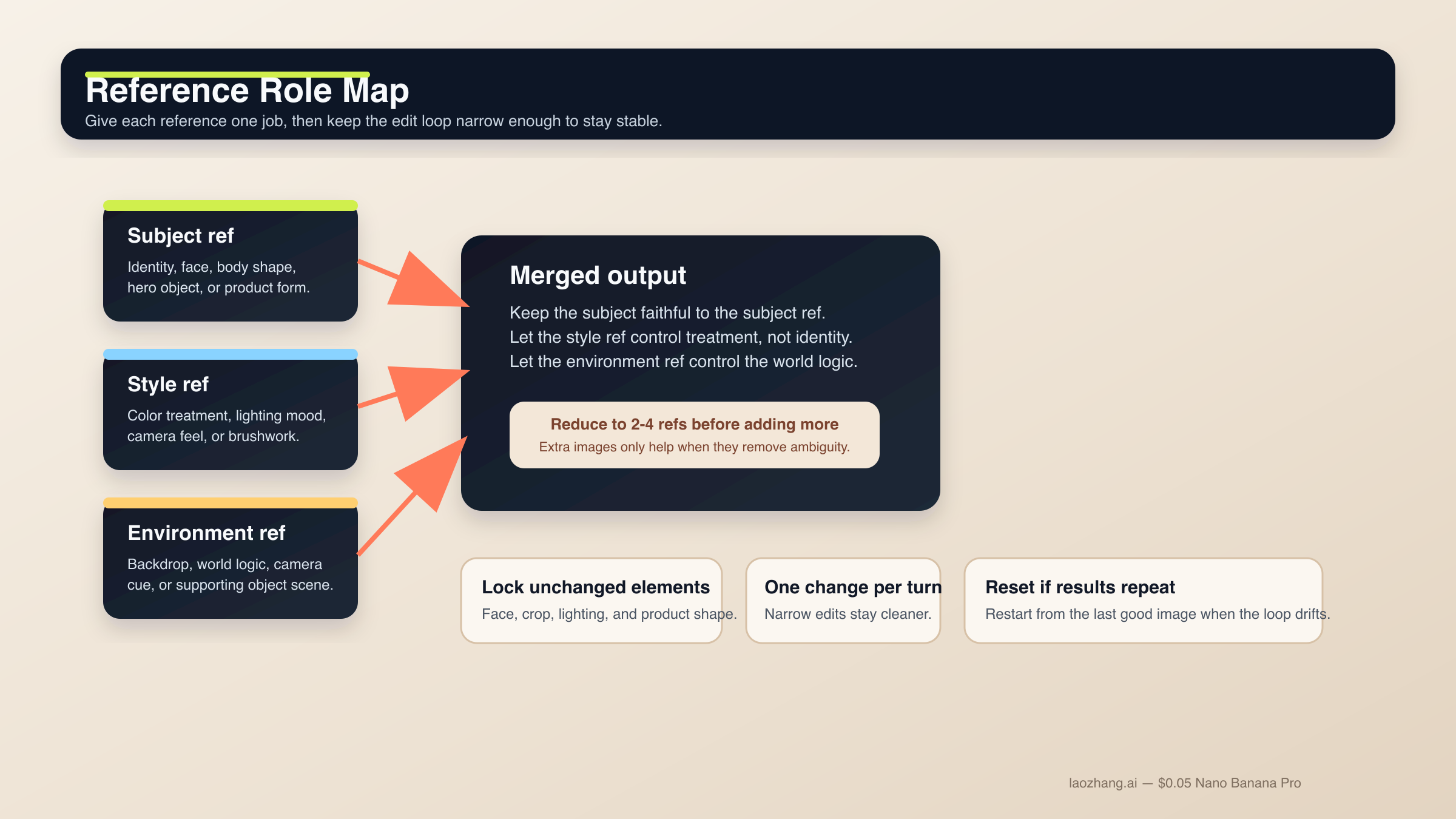
이 영역은 Nano Banana 2가 가장 유용하면서도 가장 쉽게 무너지는 곳입니다. semantic editing 자체는 강하지만, 무엇을 고정해야 하는지 말하지 않으면 drift가 커집니다. reference도 마찬가지입니다. 현행 docs가 더 많은 입력을 허용하더라도, 실제로 안정적인 설정은 적은 수의 이미지에 분명한 역할을 주는 방식입니다.
편집 workflow를 더 넓게 보고 싶다면 Gemini image-to-image editing 가이드 도 같이 보는 편이 좋습니다.
7. change-only edit
하나만 바꾸고 나머지는 보존하고 싶을 때 사용합니다.
textUsing the provided image, change only the jacket color to deep forest green.
Keep the same face, pose, body position, camera crop, lighting direction, background blur, and fabric texture.
Do not change any other clothing items or the expression.
Output intent: controlled wardrobe edit.
변경 범위가 좁고 locked detail이 명시되어 있으므로 작은 요청이 장면 전체 재작성으로 번지지 않습니다.
8. 역할 기반 reference blend
여러 이미지가 서로 다른 이유로 중요할 때 씁니다.
textUse Image A for the subject's face and body proportions.
Use Image B for the illustration style and color treatment.
Use Image C for the forest environment and fog mood.
Create a 3:4 fantasy book-cover portrait of the subject walking through that forest at dawn.
Keep the face closest to Image A, the brushwork closest to Image B, and the atmosphere closest to Image C.
Constraints: preserve one clear focal subject and avoid mixing the references into a crowded collage.
Output intent: character-led cover art.
각 이미지가 한 가지 job만 맡기 때문에 모델이 무엇을 우선해야 하는지 훨씬 분명해집니다.
9. reference-driven product mockup
제품 형태는 충실히 유지하면서 주변 world만 바꾸고 싶을 때 씁니다.
textUse Image A as the handbag reference and Image B as the photography-style reference.
Create a 4:5 fashion campaign image of a woman walking in Paris at golden hour while carrying the handbag from Image A.
Keep the bag shape, hardware, stitching, and materials faithful to Image A.
Use the editorial color treatment, soft lens bloom, and shallow depth of field style from Image B.
Constraints: the bag must remain the hero object even though the scene is lifestyle-driven.
Output intent: product campaign creative.
product와 style을 분리하기 때문에 "이 제품을 저 사진처럼 보여 줘"보다 훨씬 제어가 잘 됩니다.
캐릭터 일관성, 스토리보드, UI 레이아웃용 템플릿
공식 docs와 model card는 Nano Banana 2가 single-image generator만이 아니라는 점을 분명히 합니다. Google은 character work, multi-turn flow, 구조화된 visual design task도 평가합니다. 하지만 모델이 자동으로 character bible이나 design system을 이해하는 것은 아닙니다. canonical detail을 고정하고 구도를 먼저 주어야 합니다.
10. 캐릭터 일관성이 필요한 장면
같은 캐릭터나 마스코트를 여러 장면에서 유지하고 싶을 때 사용합니다.
textUse the provided character image as the canonical reference.
Create a 16:9 scene of the same character standing in a bright startup office, holding a tablet and talking with a small team.
Keep the same face, hair shape, body proportions, jacket color, and overall age.
Only change the pose, camera angle, and environment.
Visual style: polished editorial realism with clean daylight and subtle depth of field.
Output intent: brand storytelling image.
identity anchor를 먼저 잠그기 때문에 장면을 바꿔도 캐릭터가 무너지기 어렵습니다.
11. 3패널 스토리보드
sequence와 continuity가 중요하고 단일 hero frame이 목적이 아닐 때 씁니다.
textCreate a 3-panel storyboard in a clean cinematic concept-art style.
Panel 1: wide establishing shot of a courier arriving at a neon-lit train platform at night.
Panel 2: medium shot as the courier opens a metal case and checks a glowing device.
Panel 3: close-up of the courier looking up as the train lights appear in the fog.
Keep the same character design, coat color, bag shape, and lighting logic across all panels.
Output intent: visual storytelling board.
각 패널에 job이 있고 consistency rule은 전체에 걸쳐 유지됩니다.
12. UI / landing-page mockup
raw illustration이 아니라 layout concept가 필요할 때 적합합니다.
textCreate a clean 16:9 SaaS landing-page mockup for a project-planning product.
The hero area should show a strong headline region on the left, one primary call-to-action button, one secondary text link, and a product dashboard preview on the right.
Use a 12-column grid feel, clear spacing, restrained color palette, and realistic interface hierarchy.
Visual style: premium modern product design, soft shadows, crisp typography, subtle gradients.
Constraints: avoid fake lorem ipsum walls and avoid cluttering the dashboard with meaningless widgets.
Output intent: polished website concept.
UI 프롬프트가 자주 실패하는 이유는 style만 말하고 구조를 말하지 않기 때문입니다. 이 템플릿은 무엇이 있어야 하는지와 hierarchy가 어떻게 느껴져야 하는지를 함께 전달합니다.
reference가 많은 UI 작업이나 brand standard에 맞춰야 하는 고난도 작업이라면 Nano Banana Pro가 더 적합한 premium-control 경로입니다. 그래서 Nano Banana Pro prompts guide 와 Nano Banana Pro reference images guide 도 같이 참고할 가치가 있습니다.
drift, 깨진 텍스트, 막히는 편집, 약한 결과를 고치는 법
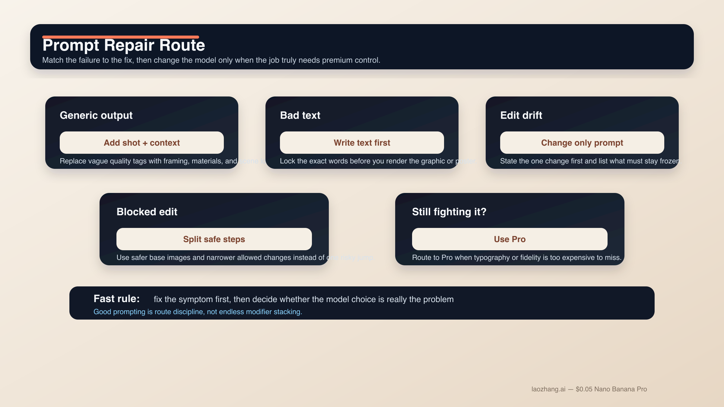
Nano Banana 2 프롬프트 실패의 상당수는 사실 신비한 문제가 아닙니다. 너무 많은 job을 한 번에 요구하거나, 살아남아야 할 요소를 고정하지 않거나, 어려운 edit를 단순한 text-to-image처럼 다루기 때문에 생깁니다. 가장 빠른 개선은 새로운 modifier pile이 아니라 더 좁은 프롬프트와 더 나은 순서입니다.
결과가 generic하고 AI스럽게 보일 때. random quality tag를 더하지 말고 shot language, scene logic, material detail을 추가하세요. "Photorealistic, detailed, 4K" 보다 "three-quarter product shot, brushed metal texture, morning side light" 가 더 강합니다.
텍스트가 계속 깨질 때. text-first로 돌아갑니다. headline, subhead, button copy, label list, legend를 먼저 확정하고 나서 exact strings를 렌더링하게 하세요. 중요한 문자열은 quotes로 감싸고 hierarchy는 단순하게 유지합니다。
편집이 너무 많이 바뀔 때. change-only prompt로 바꿉니다. 변경점 하나를 먼저 쓰고 그다음 face, pose, crop, lighting, background, texture 같은 locked elements를 나열합니다.
reference blend가 탁해질 때. 사용하는 reference를 줄이세요. subject, style, environment로 나누는 2-4장 구성이 반쯤 관련된 6장보다 훨씬 안정적입니다.
scene이 너무 복잡할 때. step-by-step prompting을 쓰세요. 배경, 주제, 텍스트 또는 localized layer 순으로 쌓는 편이 안전합니다. Nano Banana 2가 multi-turn에서 강한 이유는 매번 전체 작업을 리셋하지 않는 조건이 있기 때문입니다.
prompt가 막히기 시작할 때. Nano Banana 2와 더 넓은 Gemini image surface의 community report를 보면, likeness preservation, sensitive transformation, 애매한 edit request는 생각보다 쉽게 policy에 걸립니다. 실무적인 해법은 filter를 속이려는 것이 아니라 더 안전한 base image를 쓰고, 허용 가능한 creative use 범위에 머무르며, 위험한 변형을 여러 allowed step으로 나누는 것입니다.
Nano Banana 2를 억지로 Pro처럼 쓰고 있을 때. prompt complexity를 계속 올리기보다 모델을 바꾸는 편이 맞습니다. Nano Banana Pro는 premium deliverable, business-critical한 typography accuracy, 더 엄격한 reference fidelity, 실패 비용이 큰 4K final asset에 더 적합합니다.
FAQ
Nano Banana 2 프롬프트는 길수록 좋나요?
반드시 그렇지는 않습니다. 완전해야 하지만 비대할 필요는 없습니다. clear intent가 있는 짧은 structured brief가 giant prompt pile보다 보통 더 안정적입니다. 복잡한 작업이라면 부족한 정보를 2턴, 3턴에서 추가하는 편이 훨씬 낫습니다.
최고 결과를 위해 영어 프롬프트가 꼭 필요한가요?
항상 그렇진 않습니다. Nano Banana 2는 여러 언어를 다루고, localized graphics도 Google의 현행 docs에 있는 실제 use case입니다. 중요한 것은 명확성, 필요한 경우의 exact quoted text, 그리고 visual job을 좁게 유지하는 것입니다. 다만 high-control brand work에서는 먼저 영어로 기준선을 잡고 그다음 현지화하는 팀이 아직 많습니다.
reference image는 몇 장이 적당한가요?
모델 상한보다 먼저 2-4장의 중요한 reference로 시작하세요. subject 하나, style 하나, environment 하나, 필요하다면 중요한 product나 object 하나 정도면 충분한 경우가 많습니다. 각 이미지가 무엇을 제어하는지 명확히 말할 수 있을 때만 더 늘리세요.
Grounding with Google Search는 모든 프롬프트를 더 좋게 만드나요?
아닙니다. 실제 장소, 표지판, 제품처럼 real-world visual fact에 의존하는 장면에서 가장 유용합니다. 추상 일러스트, 스타일 portrait, 이미 scene logic이 분명한 product shot에서는 중요도가 낮아집니다.
언제 Nano Banana 2를 그만 다듬고 Nano Banana Pro로 넘어가야 하나요?
typography accuracy가 business-critical해졌을 때, reference fidelity를 더 엄격하게 맞춰야 할 때, 혹은 실패 비용이 큰 premium 4K brand asset 단계에 들어갔을 때입니다. Nano Banana 2를 억지로 premium-control tool처럼 만들기 위해 너무 많은 turn을 쓰고 있다면, 대개는 프롬프트 문제가 아니라 라우팅 문제입니다.
결론은 단순합니다. Nano Banana 2의 강한 프롬프트는 한 가지 분명한 일을 하는 짧은 production brief처럼 쓰는 것이 가장 좋습니다. 구조화된 공식에서 시작하고, 작업에 맞는 템플릿군을 고르고, 어려운 텍스트와 복잡한 edit는 단계로 나누세요. 화려한 prompt library보다 덜 반짝여 보일 수는 있어도, 실제로는 이 방식이 가장 잘 스케일합니다.