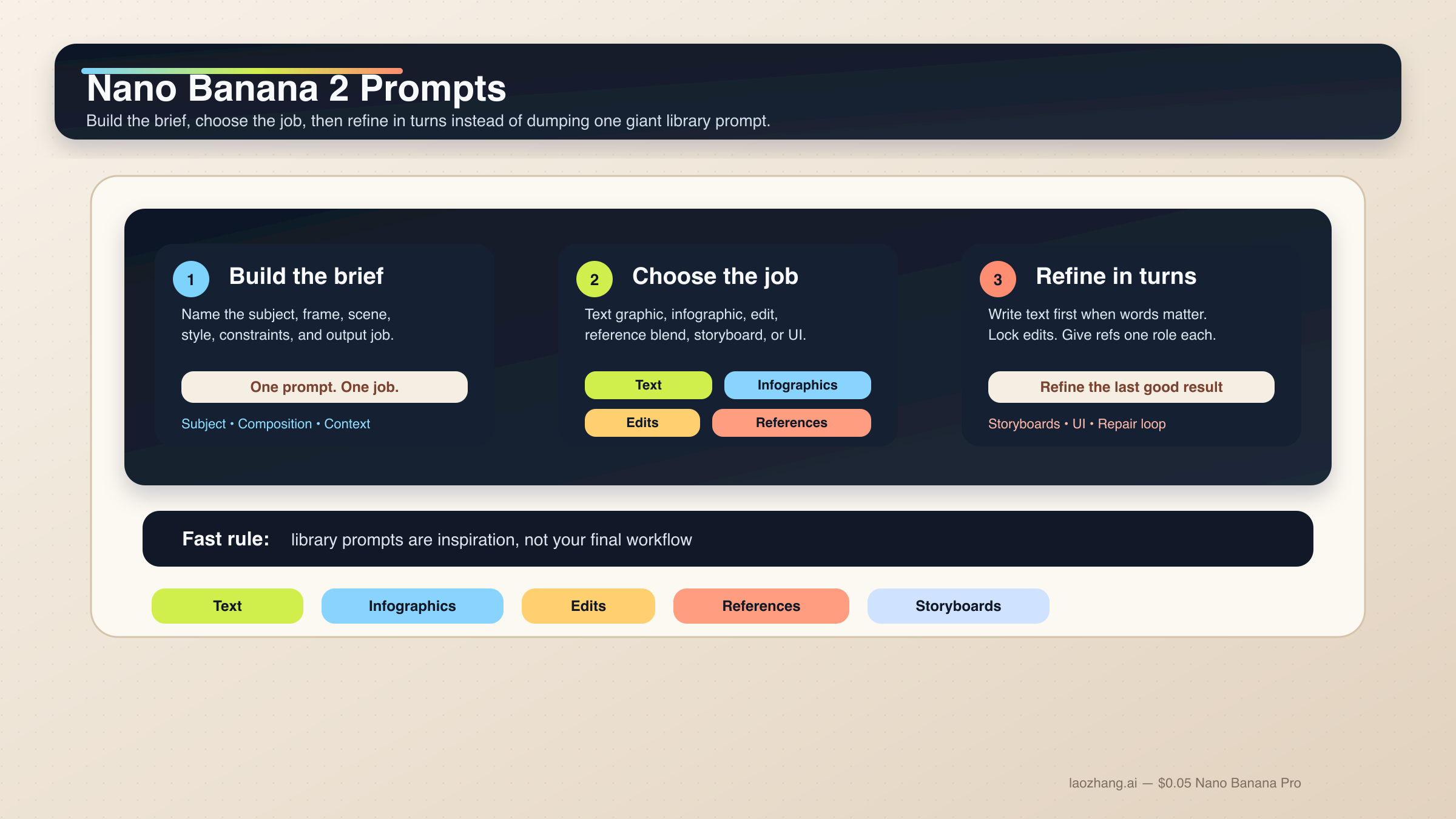
Nano Banana 2で安定して効くプロンプトは、巨大なkeyword pileではありません。subject、composition、action、context、style、constraintsを順番に置いた短い制作briefです。そのうえで、その仕事に本当に必要な制御だけを足します。文字グラフィック、インフォグラフィック、編集、参照画像の仕事では、この形のほうがprompt libraryを増やすよりはるかに再現しやすいです。
短い答え: Nano Banana 2は、6要素の構造化プロンプトから始めるのが最も安全です。文字が重要な仕事ではtext-firstの2段階フローを使い、編集や参照画像では変えてはいけない要素を先に固定し、各referenceに1つずつ役割を与えてください。
これはGoogleの現行ガイダンスとも一致しています。gemini-3.1-flash-image-preview、つまりNano Banana 2の中核モデルについて、Googleの公式ドキュメントは一貫して、具体性、文脈、意図、会話的な反復、複雑なシーンの段階的構築を重視しています。文字入り画像についても、先にテキストを決めてから画像に入れるほうが安定すると明記されています。
このローカライズ版では、もう1つ実務上の前提も明示しておきます。多くのユーザーは今でもGeminiに英語の作業用プロンプトをそのまま入れています。そこで、下のコードブロックは英語のoperational wordingをできるだけ維持しています。実際にローカライズすべきなのは、引用符の中のheadlineやlabel、そしてタスクの構造です。
ただし、早めに見せておくべき caveat があります。Nano Banana 2は多くの高速な画像作業のdefault routeですが、すべての仕事の正解ではありません。premium typography、より厳密なreference fidelity、高価値なbrand assetが必要なら、次に読むべきは Nano Banana 2 vs Nano Banana Pro です。多くのケースで大切なのは、モデルをすぐ変えることではなく、Nano Banana 2をrandom prompt toyではなくworking creative systemとして扱うことです。
| 仕事の種類 | まず使うべき型 | 絶対に省けない部分 |
|---|---|---|
| 文字グラフィックやポスター | exact-textの2段階フロー | 先に文言を決めて、それを画像プロンプトに正確に入れる |
| インフォグラフィックや図解 | factual layout prompt | 構成要素と階層を指定し、最後は人が確認する |
| 写真編集 | change-only prompt | 変える点と固定する点を両方書く |
| 参照画像のブレンド | role-based multi-image prompt | 各画像にsubject、style、product、environmentのどれか1つを割り当てる |
| キャラクター一貫性 | canonical-reference prompt | 顔、体比率、衣装のアンカーを先に固定する |
| ストーリーボードやUIモック | composition-first prompt | まず構成、次にスタイルを書く |
まずはこの Nano Banana 2 プロンプト公式から始める
Nano Banana 2のプロンプトを強くしたいなら、prompt libraryの断片を継ぎ足す発想をやめるのがいちばん速いです。このモデルは、説明的なscene prompt、制御されたedit、multi-turn refinementには強い一方、ばらばらの形容詞スタックにはそこまで強くありません。良いプロンプトは、短いcreative briefのように読めます。
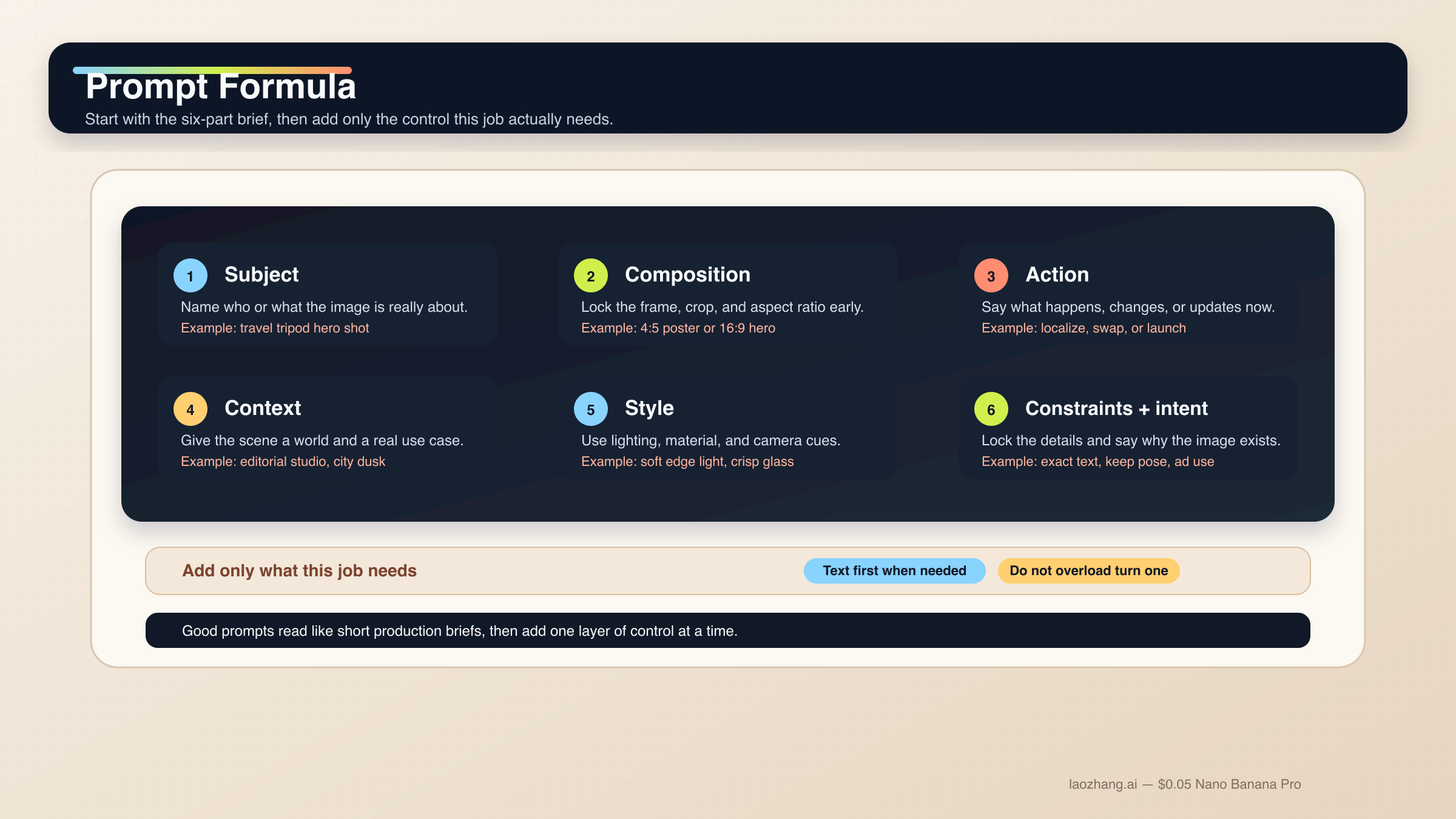
迷ったときは、この基本式を使ってください。
text[Subject]. Framed as [composition / lens / aspect ratio].
[Action or change].
Set in [scene / environment / context].
Visual style: [lighting / materials / color / mood].
Constraints: [what must remain, exact text, references, things to avoid].
Output intent: [poster / product shot / infographic / storyboard / UI / edit].
各パートの役割は次の通りです。
Subject: 画像の中心になるもの。Composition: 画角、距離、アスペクト比、トリミング。Action or change: 何が起きるか、何を変えるか。Context: どんな世界・状況で起きるか。Style: 光、素材、色、トーン。Constraints and output intent: exact text、固定要素、layout要件、この画像の仕事。
いちばん崩れやすいのは最後です。多くの人はstyle wordが足りないと思いがちですが、実際にはintentが弱いことのほうが多いです。たとえば "Create a logo" は広すぎますが、"Create a logo for a minimalist skincare brand sold in premium hotel spas" ならモデルにusable jobが渡ります。Nano Banana 2はintentを推定できますが、何のための画像なのかはやはり人が与える必要があります。
公式の Gemini image-generation docs も、specific prompts、context、iteration、step-by-step construction の重要性を強調しています。さらに Gemini 3.1 Flash Image model card では、text rendering、infographics、character work、multi-turn editing、multi-image tasks が評価軸に入っています。だからこそ、task-firstのガイドはgeneric inspiration galleryより役に立ちます。
このモデル群でさらに大事なのは、1プロンプト1ジョブです。exact text、localization、既存画像へのeditを同時にやりたいなら、段階に分けたほうが安全です。複数キャラクターや多オブジェクトでも同じで、まず階層を書き、必要なら複数turnに分けてください。Googleの現行ドキュメントでは、Nano Banana 2は最大4キャラクター、最大10オブジェクト、最大14 reference imagesを扱えるとされていますが、これはcapability ceilingであって、毎回そこまで詰め込むべきという意味ではありません。
実務では、まずベース構図を取り、次に残したいディテールを固定し、その後にexact textやlocalized layerを入れ、最後にdriftだけを狭く修正する流れが最も安定します。モデル全体の表面を先に把握したいなら、Nano Banana 2とGemini 3.1 Flash Image Preview を先に読むと全体像がつかみやすいです。
文字、インフォグラフィック、ローカライズ画像向けのテンプレート
Nano Banana 2は、旧来のGemini image flowより文字やインフォグラフィックに強くなりましたが、それでも "text in image" を一発の魔法だと思わないほうが結果は安定します。文字がdeliverableの一部なら、先にcopyを決め、その後でどう表示するかを指定してください。
1. exact text が入るポスターやlaunch graphic
文字が画像の一部であり、後付けではない仕事に向いています。
textTurn 1:
Write one 6-word headline and one 14-word subhead for a launch poster about a lightweight travel tripod for creators.

Turn 2:
Create a 4:5 product launch poster for a compact carbon-fiber travel tripod standing on a stone pedestal. Clean premium studio look, muted graphite background, soft edge lighting, wide top margin.
Render the exact headline "READY TO MOVE LIGHT" in bold uppercase sans-serif near the top.
Render the exact subhead "Stable enough for long exposure, small enough for a carry-on." below it in smaller white text.
Keep the typography crisp, aligned, and readable at thumbnail size.
Output intent: premium ad creative.
なぜ効くかというと、先にcopyが固まることで、Nano Banana 2は文言生成ではなく構図とrenderに集中できるからです。
2. インフォグラフィックやラベル付き図解
画像が説明の役目を持つときに使います。
textCreate a 16:9 infographic explaining a mirrorless camera sensor stack. Show these labeled components from front to back: cover glass, microlens array, color filter array, photodiodes, wiring layer, sensor substrate.
Use a clean flat editorial style with wide margins, short labels, thin leader lines, and one callout area for "light path".
Keep the diagram factual, readable, and easy to scan in 3 seconds.
Output intent: educational article graphic.
ここで重要なのはvisual moodよりinformation architectureです。
3. 既存グラフィックの言語だけを差し替える
英語版がすでに機能していて、言語だけ変えたいケースに向いています。
textUpdate this existing infographic to Spanish.
Do not change the layout, icon positions, color system, chart proportions, or visual hierarchy.
Replace all English text with natural Spanish text that fits the same design style.
Keep the headings short and the body labels easy to read.
Output intent: localized marketing graphic.
これはchange-onlyのlocalization promptです。固定すべきものを先に教えるので、余計なlayout driftが起きにくくなります。
写実シーン、プロダクトショット、ブランドビジュアル向けテンプレート
Nano Banana 2は "realistic" とだけ書くより、写真家やart directorのようにshotを説明したほうが大きく改善します。composition、lens feel、lighting、画像の役割のほうが、generic quality modifierより重要です。
4. Editorial portrait
被写体を写真らしく見せたいときに使います。
textA waist-up editorial portrait of a ceramic artist in a bright studio. 3:4 composition, subject slightly off-center, captured with an 85mm portrait lens look.
The artist is shaping a clay bowl while looking just past the camera.
Set in a sunlit workshop with pale walls, wooden shelves, and small traces of clay dust in the air.
Visual style: soft natural window light from camera-left, warm skin tones, realistic fabric texture, calm magazine mood.
Constraints: keep the hands natural and the studio believable.
Output intent: editorial feature image.
このpromptは、構図、動作、どのリアリティが重要かを同時に伝えます。
5. Product hero または launch banner
商品が主役で、layoutも商用に使える必要があるときに使います。
textCreate a 16:9 premium product hero image of a matte black wireless speaker on a dark stone plinth.
Three-quarter view, low camera angle, the speaker centered with controlled negative space on the left for future headline placement.
Set in a minimal studio environment with subtle haze and soft reflected highlights.
Visual style: luxury commercial photography, clean shadows, brushed texture detail, restrained graphite and silver palette.
Constraints: no extra props, no floating UI, no fake sales text.
Output intent: homepage hero banner.
商品だけでなく、余白の意味まで指定しているので使いやすい構図になります。
6. 実在アンカーを持つ travel / city scene
現実世界の文脈が重要で、Grounding with Google Searchを使えるフロー向けです。
textCreate a twilight editorial travel image of a rain-slicked street scene near Pike Place Market in Seattle.
Wide environmental composition with the market sign visible in the scene and the Space Needle grounded in the distance.
The foreground should include a couple under one umbrella walking past a cafe chalkboard.
Visual style: cinematic wet reflections, realistic signage, cool blue ambient light with warm cafe spill.
Constraints: keep the city details plausible and the typography readable.
Output intent: travel feature illustration.
実在の視覚アンカーとscene goalをセットで渡しているので、単なる地名の羅列よりも狙いが明確です。
編集、参照画像、マルチイメージ合成向けのテンプレート
この領域は、Nano Banana 2が最も便利で、同時に最も壊れやすいところです。semantic editing自体は強いのですが、何を固定するかを言わないとdriftしやすくなります。referencesも同じで、現行docsが多くの参照を許していても、実務で安定するのは少数で役割が明確な構成です。
編集フロー全体をもっと見たいなら、Gemini image-to-image editing ガイド も合わせて読む価値があります。
7. change-only edit
1つだけ変えて、他を残したいときに使います。
textUsing the provided image, change only the jacket color to deep forest green.
Keep the same face, pose, body position, camera crop, lighting direction, background blur, and fabric texture.
Do not change any other clothing items or the expression.
Output intent: controlled wardrobe edit.
変更点が狭く、locked detailsが明示されているので、小さな依頼がscene rewriteに化けにくくなります。
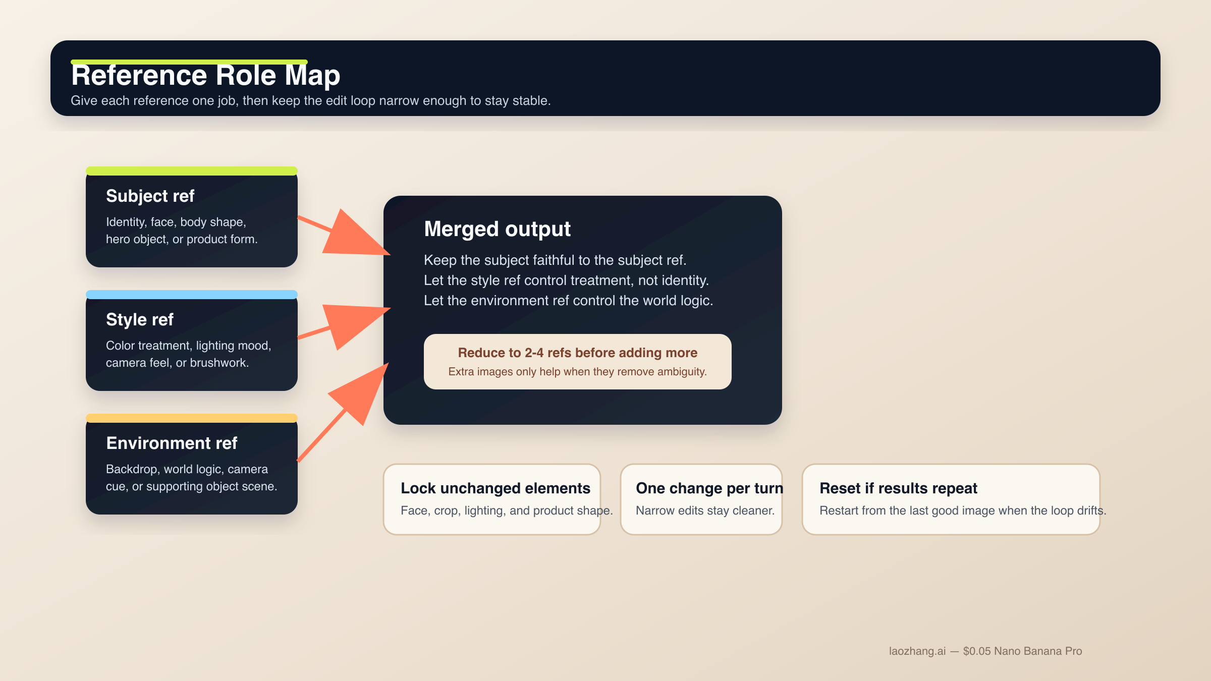
8. role-based reference blend
複数画像が異なる意味で重要なときに使います。
textUse Image A for the subject's face and body proportions.
Use Image B for the illustration style and color treatment.
Use Image C for the forest environment and fog mood.
Create a 3:4 fantasy book-cover portrait of the subject walking through that forest at dawn.
Keep the face closest to Image A, the brushwork closest to Image B, and the atmosphere closest to Image C.
Constraints: preserve one clear focal subject and avoid mixing the references into a crowded collage.
Output intent: character-led cover art.
各imageに1つのjobしか与えないので、モデルがどの要素を優先すべきか判断しやすくなります。
9. reference-driven product mockup
プロダクト形状を忠実に保ちつつ、周囲のworldを変えたいときに使います。
textUse Image A as the handbag reference and Image B as the photography-style reference.
Create a 4:5 fashion campaign image of a woman walking in Paris at golden hour while carrying the handbag from Image A.
Keep the bag shape, hardware, stitching, and materials faithful to Image A.
Use the editorial color treatment, soft lens bloom, and shallow depth of field style from Image B.
Constraints: the bag must remain the hero object even though the scene is lifestyle-driven.
Output intent: product campaign creative.
productとstyleが分離されるので、"この商品をこの写真っぽくして" よりもはるかに制御しやすくなります。
キャラクター一貫性、ストーリーボード、UIレイアウト向けテンプレート
公式docsとmodel cardは、Nano Banana 2がsingle-image generatorだけではないことを示しています。Googleはcharacter work、multi-turn flow、より構造化されたvisual design taskも評価しています。ただし、モデルが自動でcharacter bibleやdesign systemを理解するわけではありません。canonical detailを固定し、構成を先に与える必要があります。
10. character consistency scene
同じキャラクターやマスコットを複数sceneで維持したいときに使います。
textUse the provided character image as the canonical reference.
Create a 16:9 scene of the same character standing in a bright startup office, holding a tablet and talking with a small team.
Keep the same face, hair shape, body proportions, jacket color, and overall age.
Only change the pose, camera angle, and environment.
Visual style: polished editorial realism with clean daylight and subtle depth of field.
Output intent: brand storytelling image.
identity anchorを先に固定するので、scene changeを入れてもキャラが崩れにくくなります。
11. 3-panel storyboard
sequenceとcontinuityが大事で、単独のhero frameが目的ではないときに使います。
textCreate a 3-panel storyboard in a clean cinematic concept-art style.
Panel 1: wide establishing shot of a courier arriving at a neon-lit train platform at night.
Panel 2: medium shot as the courier opens a metal case and checks a glowing device.
Panel 3: close-up of the courier looking up as the train lights appear in the fog.
Keep the same character design, coat color, bag shape, and lighting logic across all panels.
Output intent: visual storytelling board.
各panelに役割がありつつ、consistency ruleが全体に効く構成です。
12. UI / landing-page mockup
layout conceptが欲しくて、raw illustrationが欲しいわけではないときに向いています。
textCreate a clean 16:9 SaaS landing-page mockup for a project-planning product.
The hero area should show a strong headline region on the left, one primary call-to-action button, one secondary text link, and a product dashboard preview on the right.
Use a 12-column grid feel, clear spacing, restrained color palette, and realistic interface hierarchy.
Visual style: premium modern product design, soft shadows, crisp typography, subtle gradients.
Constraints: avoid fake lorem ipsum walls and avoid cluttering the dashboard with meaningless widgets.
Output intent: polished website concept.
UI promptが失敗しやすいのはstyleしか語らないからです。このテンプレートは、何を含めるべきかと hierarchy の感じ方を両方教えます。
よりreference-heavyなUI作業や、brand standardsへの厳密な一致が必要なときは、Nano Banana Proのほうがpremium-controlに向いています。そのため Nano Banana Pro prompts guide と Nano Banana Pro reference images guide も価値があります。
drift、文字崩れ、編集ブロック、弱い出力の直し方
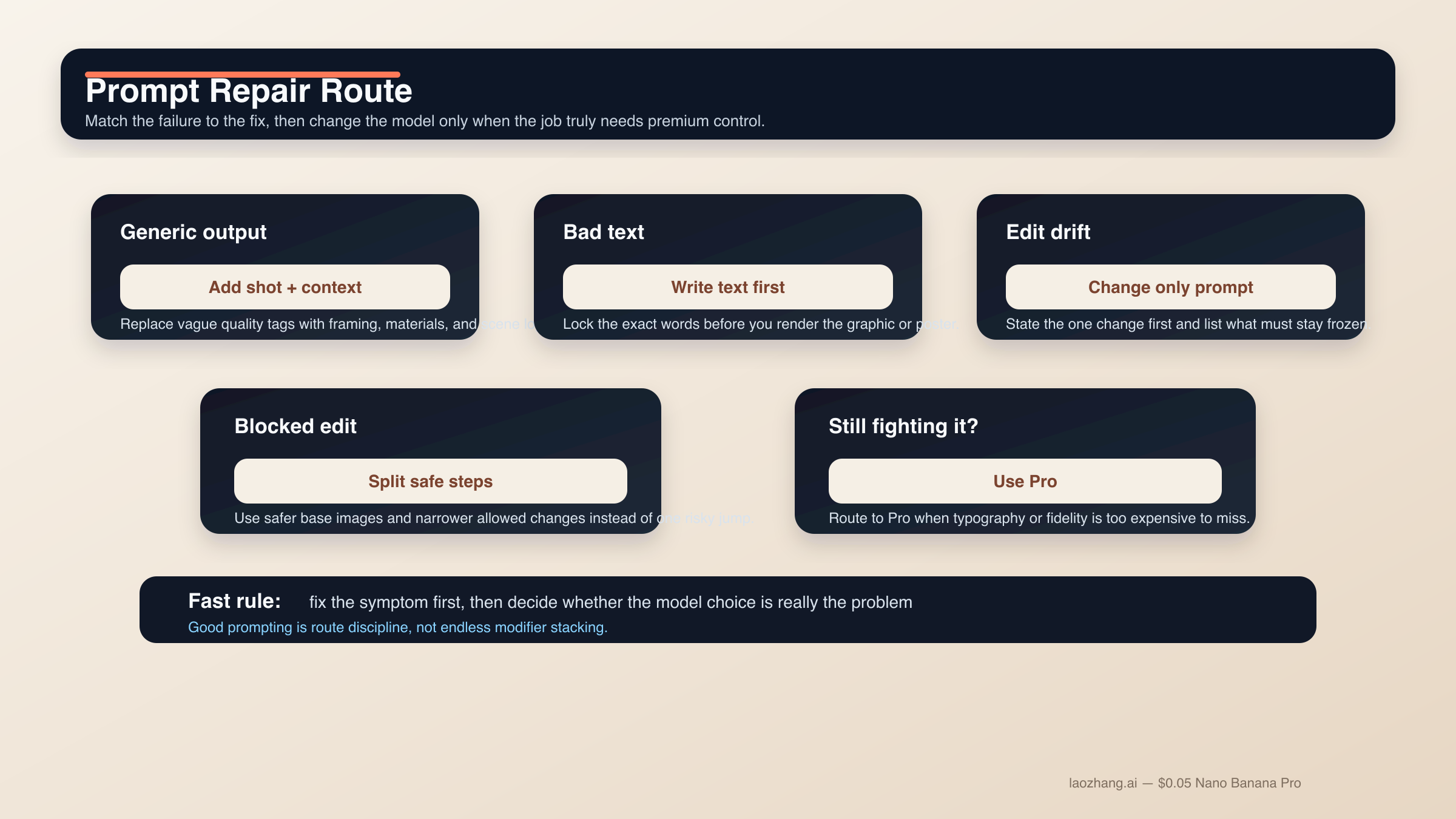
Nano Banana 2 promptの失敗の多くは、実は謎ではありません。やり過ぎた同時要求、固定すべき要素の不足、難しいeditを単純なtext-to-imageとして扱うことが主因です。改善に効くのは新しいmodifier pileではなく、より狭いpromptと正しい順番です。
結果がgenericでAIっぽいとき。 random quality tagを足すのではなく、shot language、scene logic、material detailを足してください。"Photorealistic, detailed, 4K" より "three-quarter product shot, brushed metal texture, morning side light" のほうが効きます。
文字が壊れるとき。 text-firstに戻ります。headline、subhead、button copy、label list、legendを先に確定し、その exact strings をあとから描画させます。重要な文字は quotes に入れ、hierarchy は単純にします。
編集が変わり過ぎるとき。 change-only promptにします。変更点を最初に書き、そのあとで face、pose、crop、lighting、background、texture などの locked elements を列挙します。
reference blend が濁るとき。 使うreferenceを減らします。subject、style、environment に分ける2〜4枚の構成が、半端に関係する6枚よりもずっと安定します。
scene が複雑すぎるとき。 step-by-step promptingを使います。背景、主役、文字やlocalized layerの順に組み立てるほうが安全です。Nano Banana 2がmulti-turnで強いのは、毎回タスク全体をリセットしない前提だからです。
prompt がブロックされ始めるとき。 Nano Banana 2やGemini image surface全体のcommunity reportを見ると、likeness preservation、sensitive transformation、曖昧なedit requestは想像以上にpolicyに触れやすいです。実務上の解決は、filterを出し抜こうとすることではなく、より安全なbase imageを使い、許容範囲のcreative useに保ち、危険な変化を複数のallowed stepに分けることです。
Nano Banana 2を無理やりProのように使っているとき。 prompt complexityを積み続けるより、モデルを切り替えるほうが正しいです。Nano Banana Proは、premium deliverable、business-criticalな文字精度、より厳密なreference fidelity、失敗コストの高い4K final assetに向いています。
FAQ
Nano Banana 2のプロンプトは長いほうがいいですか。
必ずしもそうではありません。完全であることは必要ですが、冗長である必要はありません。clear intentを持つ短いstructured briefのほうが、巨大なprompt pileより安定します。複雑な仕事なら、足りない情報を2ターン目、3ターン目で補うほうが安全です。
最良の結果のためには英語プロンプトが必要ですか。
常にではありません。Nano Banana 2は複数言語を扱えますし、localized graphicsもGoogleの現行docsにある実用例です。重要なのは、明確さ、必要なときのexact quoted text、そしてvisual jobを狭く保つことです。high-controlなbrand workでは、最初に英語で基準を取り、その後でローカライズするチームは今も多いです。
reference imageは何枚使うべきですか。
モデルの上限より、まず2〜4枚の重要なreferenceから始めてください。subject、style、environment、必要なら重要なproductやobjectの1枚で十分なことが多いです。各画像が何を制御するかを明確に言えるときだけ増やします。
Grounding with Google Searchはすべてのpromptを良くしますか。
いいえ。実在の場所、標識、商品などreal-world visual factに依存するsceneでは有効ですが、抽象イラスト、スタイライズドportrait、scene logicがすでに明確なproduct shotでは重要度が下がります。
Nano Banana 2の改良をやめてNano Banana Proに切り替えるべき時はいつですか。
文字精度がbusiness-criticalになったとき、reference fidelityをより厳密にしたいとき、あるいは失敗コストの高いpremium 4K brand assetになったときです。Nano Banana 2を無理にpremium-control toolへ押し上げるためにturnを使い過ぎているなら、たいていはルーティングの問題です。
結論は単純です。Nano Banana 2の強いプロンプトは、1つの明確な仕事を持つ短いproduction briefとして書かれます。構造化された公式から始め、仕事に合うテンプレート群を選び、難しい文字や複雑なeditは段階に分ける。このやり方は派手なprompt libraryより地味ですが、実際にはこちらのほうがずっとスケールします。